

Warmth is the defining direction for kitchen colour schemes in 2026. Burgundy makes a confident statement on cabinetry and islands, while butter yellow brings a softer accent alongside creamy whites, beige, stone and wood. Natural timber and earthy shades such as taupe, mushroom, oat, clay and olive green help create a layered, welcoming palette.
Choosing a kitchen colour is about more than following a trend: the shades need to feel right in your home and work together across cabinets, surfaces and smaller details. You might love the richness of burgundy but want a lighter touch, or prefer a calm neutral scheme with warmth and texture.
This guide explores practical ways to use these colours. See how butter yellow can add a gentle lift, how natural wood and textured materials bring depth, and how warm neutrals can provide a versatile foundation for a kitchen that feels current and personal.
Key Takeaways
- Use burgundy on cabinetry or an island to create a confident focal point, then balance its depth with lighter elements.
- Bring butter yellow into smaller details for a gentle lift, pairing it with soft, warm shades.
- Layer natural wood with textured stone and warm finishes to give the kitchen depth and character.
- Build a flexible foundation with earthy neutrals, then consider deeper tones such as olive green or burnt ochre for contrast.
Burgundy statement cabinetry and islands
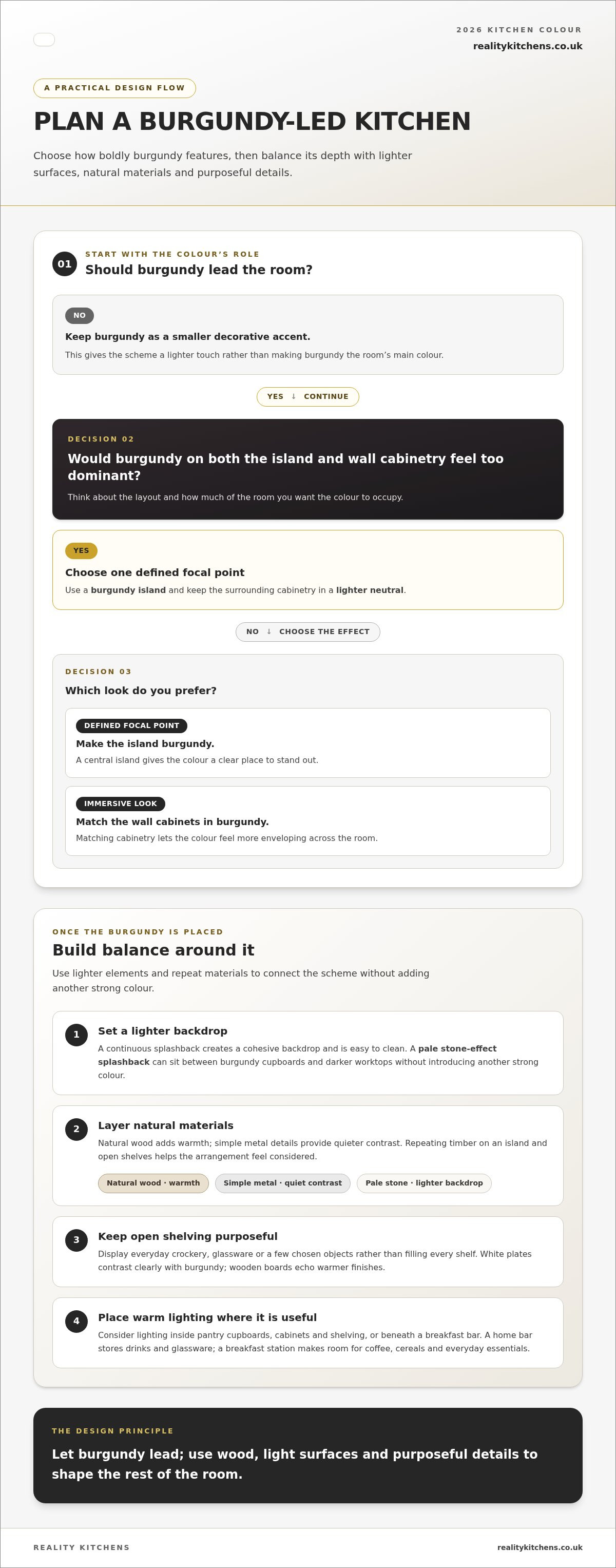
Burgundy brings depth and visual weight to a kitchen, especially across full-height cabinetry or a central island. In 2026, it can act as the room’s main colour rather than a small decorative accent. Choose where it appears according to the kitchen’s layout: a burgundy island creates a focal point, while matching wall cabinets make the colour more immersive. If both feel too dominant, use burgundy on the island and keep surrounding cabinetry in a lighter neutral.
Balance burgundy with surfaces that tie the scheme together. A continuous splashback creates a cohesive backdrop and is easy to clean. For example, a pale stone-effect splashback can separate burgundy cupboards from darker worktops without introducing another strong colour. Natural wood adds warmth, while simple metal details provide a quieter contrast. Repeating a material, such as timber on an island and open shelves, helps the arrangement feel considered.
Open shelving can soften a run of bold cabinetry. Display everyday crockery, glassware or a few chosen objects rather than filling every shelf. White plates contrast clearly with burgundy cupboards, while wooden boards echo warmer finishes. Curate the display around items you use so the shelves add character without becoming crowded.
Plan lighting around how you use each area. Warm lighting can sit inside pantry cupboards, cabinets and shelving, or beneath a breakfast bar. A home bar stores drinks and glassware; a breakfast station makes room for coffee, cereals and everyday essentials. These zones add function to a burgundy scheme without introducing more colour. Before settling on the layout, consider these practical choices:
- Use burgundy on the island for a single, defined focal point.
- Pair bold cabinetry with a continuous, lighter splashback.
- Reserve open shelves for useful items and a few personal details.
- Place warm lighting where cupboards, shelves or a breakfast bar need illumination.
Together, these choices let burgundy lead, while wood, light surfaces and purposeful details shape the rest of the room.
Butter yellow accents
Butter yellow is a popular kitchen accent colour for 2026, pairing naturally with gentle whites, creamy beiges, stone and soft wood. Its appeal lies in its softness: it adds warmth without taking over the palette. Consider the shade beside fixed elements first. For example, butter yellow can brighten a pale stone worktop, while a cream wall keeps the overall effect gentle.
Use butter yellow selectively for a lighter touch. A painted island, a short run of cabinets or a breakfast-area detail can introduce colour while leaving most surfaces neutral. In a kitchen with white cabinetry, a butter-yellow island makes a clear focal point. If the room already features warm timber, smaller yellow accents can echo that warmth without competing with the grain.
For balance, choose one main neutral and repeat it across larger surfaces. Cream cabinetry and a stone worktop give yellow room to stand out, while soft wood adds another natural note. Avoid combining several equally strong colours. Let butter yellow lead in one area, then use handles, taps or accessories to connect it to the rest of the room. A ceramic bowl or everyday cups can help you try the colour before using it on a larger surface.
- Pair butter yellow with gentle white for a crisp, light contrast.
- Combine it with creamy beige for a softer, closer-toned palette.
- Set it against stone to make the accent distinct but restrained.
- Add soft wood when the room needs another warm, natural element.
Before settling on a paint or finish, view the yellow beside your chosen worktop, cabinetry and flooring. The surrounding materials affect how the colour reads, so a sample placed next to pale stone may feel different from one beside warm timber. This simple comparison helps you decide whether to use butter yellow on a prominent feature or in smaller details. Either way, the 2026 trend works best as part of a joined-up palette, not an isolated splash of colour.
Natural wood and textured materials
Natural wood in varied hues is a defining material in kitchen colour schemes for 2026. Pairing timber with patinated metals, warm finishes and textured stone creates a layered design. For example, pale oak cabinetry can sit beside a tactile stone worktop, with aged metal handles adding a subtle contrast. A darker wood can bring more depth, while lighter timber keeps the composition feeling open.
Decide what role wood will play. Use it across cabinet fronts for a stronger, continuous presence, or introduce it through an island, shelving or a breakfast bar. Then choose a stone surface that complements the grain. A softly veined worktop beside smooth timber creates contrast without another bold colour. Alternatively, more visibly textured stone can add character to simple wood cabinetry.
Patinated metals add another layer, especially when the kitchen needs a subtle contrast. Consider handles, taps or lighting details in a muted metal finish. Repeating that finish in a few places connects different materials. Keep the combination deliberate: wood grain, stone texture and metal patina each draw attention, so balance them across the room.
- Use one wood tone prominently, then bring in a second through a smaller feature.
- Match stone texture to the grain, choosing either a quiet contrast or a more tactile pairing.
- Repeat a patinated metal finish across selected details for cohesion.
- Compare samples together, including the timber, stone and metal, before finalising the palette.
Compare material samples side by side in your kitchen, rather than judging each in isolation. A warm finish can make pale timber feel richer, while cool-looking stone may change the overall impression. Check the combination against cabinet fronts and flooring, too, to see whether the layers feel balanced across the room. This creates a scheme shaped by colour, grain and surface, not paint alone.
Warm neutrals and earthy kitchen colours
Warm neutrals anchor kitchen colour schemes in 2026: taupe, mushroom, stone, oat and clay are joined by olive green, sand, charcoal black and burnt ochre. Use a soft neutral across larger surfaces, then introduce a deeper shade where you want contrast, such as an island or cabinet run.
Bold colours create a strong focal point, while neutral palettes are easier to adapt as accessories change. For balance, pair clay cabinetry with pale walls, or keep cabinets neutral and use olive on a smaller feature.
Soft white, creamy beige and pale stone walls work well with warm cabinetry, while pale stone worktops can keep burgundy or olive from dominating. Match undertones: warm beige walls sit more naturally beside oat cabinets than noticeably cool grey.
Two-tone combinations define a kitchen without relying on one shade throughout. Try taupe wall cabinets with a deeper olive island, or pair pale oak with charcoal details. For softer contrast, combine mushroom cabinetry with a stone worktop, letting texture provide the difference rather than colour.
In a small or north-facing UK kitchen, lighter shades such as oat, soft white and pale stone can help the room feel open. Use deeper colours selectively, perhaps on an island or lower cabinets, rather than across every surface.
Natural light changes how colours appear throughout the day, while warm lighting can make taupe or clay feel richer. Compare paint and worktop samples in the kitchen, both near a window and under the room’s evening lights.
Colour alone does not make a finish durable or easy to clean. Choose a washable paint finish suitable for kitchens, and test a sample near practical areas such as the hob or sink before committing.
Warm neutrals, natural wood and soft whites create a versatile look to suit different tastes. No colour scheme guarantees added value, so choose a cohesive combination, such as oat cabinets, pale stone and timber details.
Reality Kitchens: Bespoke Kitchen Design
Reality Kitchens can bring your preferred palette together through bespoke kitchen design. If you’re weighing burgundy cabinetry against warm neutrals, the design can coordinate colours, cabinetry and practical details for your home. Worktops, kitchen components and appliances can also form part of the overall scheme.
Share the shades and materials you like, along with how you use the room. This helps shape a design around your chosen finishes, from earthy cabinet colours to a contrasting worktop. Reality Kitchens visits homeowners at home to discuss their requirements and plan their kitchen.
If you’re ready to explore a palette for your kitchen, contact Reality Kitchens.
Make your colour choices work for your home
Use the kitchen colour schemes of 2026 as a starting point, not a rulebook. The strongest choice is one that suits your home, the light in your kitchen and the way you use the space. Before committing, bring samples together and consider how cabinet colours, worktops and finishes look as a complete composition.
Reality Kitchens brings those decisions into a practical design, combining bespoke kitchen design with kitchen components and appliances. This can help when you’re ready to move from colour inspiration to planning a cohesive kitchen around your preferences.
Take the next step at your own pace. Discuss your kitchen with Reality Kitchens and explore how your chosen palette could shape a space that feels right for you.
Frequently Asked Questions
What are the biggest kitchen colour trends for 2026 in the UK?
The direction is warmer, more layered colour, pairing expressive shades with natural finishes. Burgundy and butter yellow offer contrasting ways to introduce colour, while wood, textured stone and earthy neutrals add depth. For balance, choose one leading shade, then coordinate the cabinet fronts, walls and worktop around it. The result is a joined-up palette, rather than a collection of separate trend features.
Which kitchen cabinet colours are expected to be popular in 2026?
Burgundy makes a statement on cabinetry, while taupe, mushroom, oat and clay offer softer options. Olive green, charcoal black and burnt ochre create stronger contrast. For example, use a muted neutral on most cabinets and reserve a deeper colour for a tall unit or island. Compare cabinet samples with flooring and worktop materials to see how the combination looks together.
Are warm neutrals replacing grey kitchens in 2026?
Warm neutrals are prominent, but grey has not disappeared, and not every kitchen needs a complete palette change. Taupe, stone and mushroom add warmth, while grey can still suit a scheme alongside natural wood or a warmer wall colour. To update an existing kitchen, introduce warmer tones through paint, accessories or a feature area before replacing larger elements.
Which kitchen colour schemes are timeless and likely to add value to a UK home?
Warm neutrals, natural wood and soft whites create a versatile look to suit different tastes. No colour scheme guarantees added value, so choose a cohesive combination, such as oat cabinets, pale stone and timber details.


